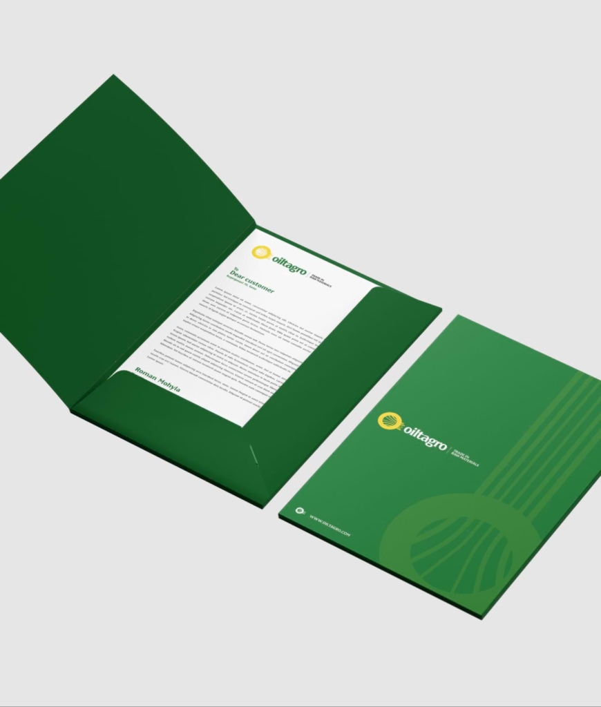
branding
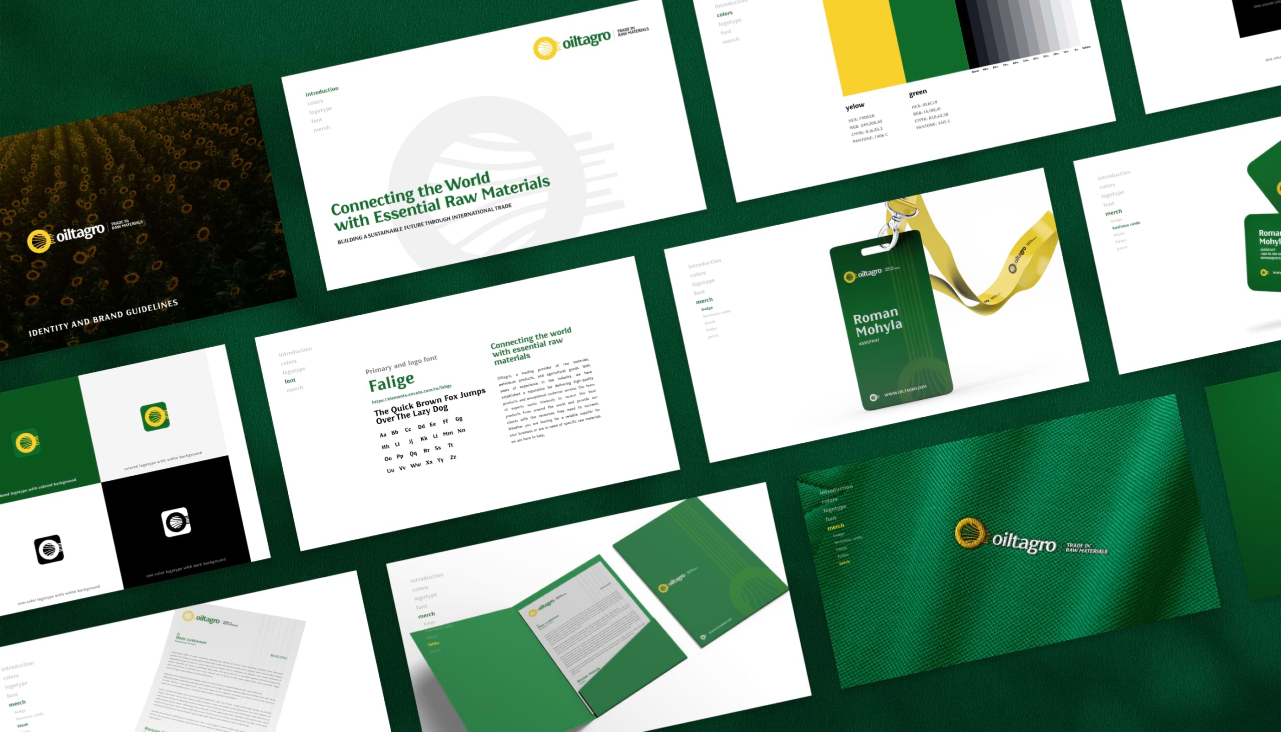
eco-friendly energy palette
Oil Tagro’s branding stands out with its green and yellow hues, conveying their dedication to environmentally sustainable energy solutions. Their logo, reminiscent of a sunflower with its internal lines, aptly symbolizes the efficient paths of energy flow and the harmony of nature.


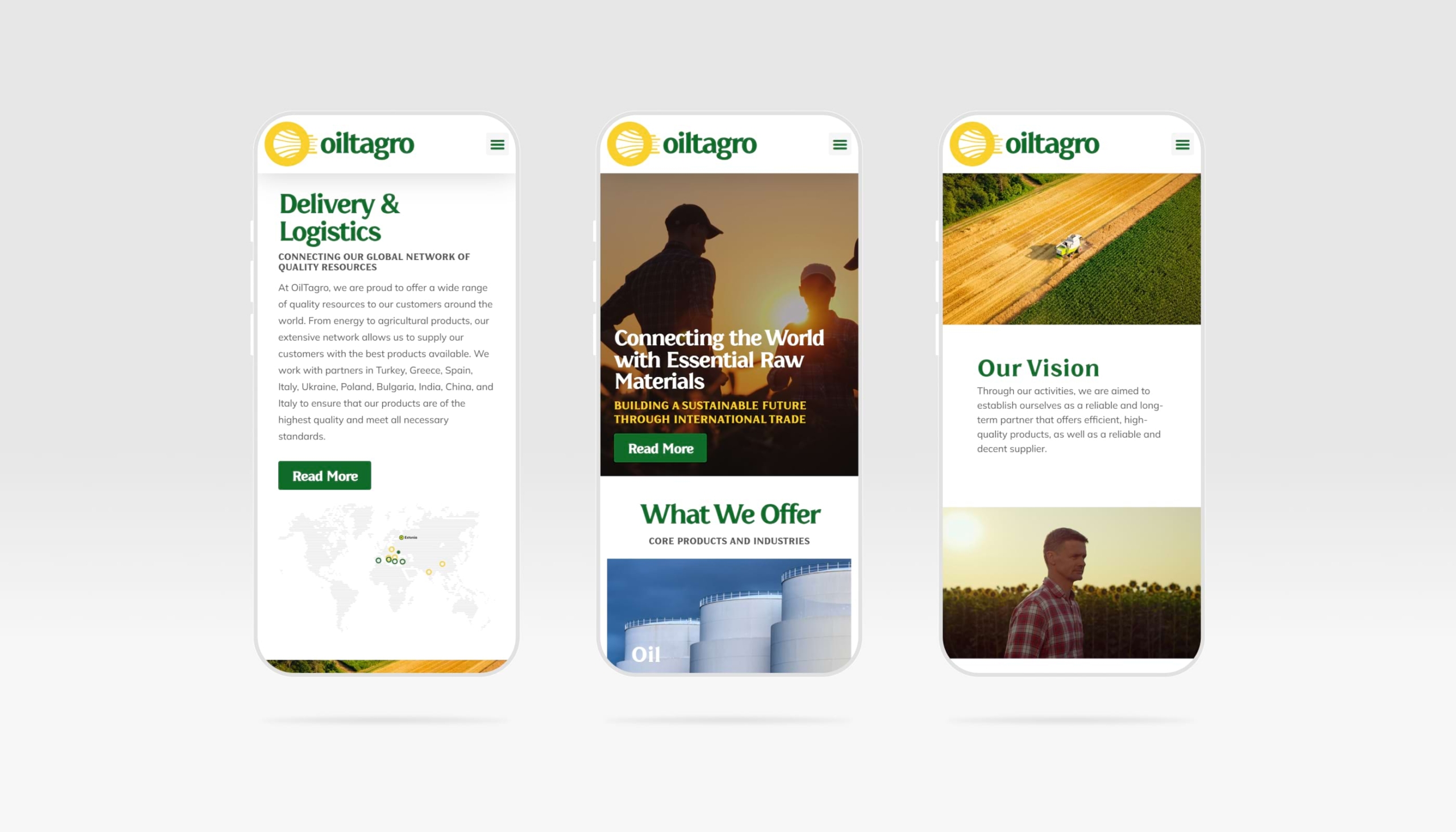
website

digital showcase of energy expertise
Oil Tagro’s corporate website serves as a sophisticated digital platform that showcases their extensive expertise in the sustainable energy sector. The website provides an in-depth look at their services, emphasizing their commitment to eco-friendly practices and solutions in energy trading.