

branding
dynamic martial arts essence
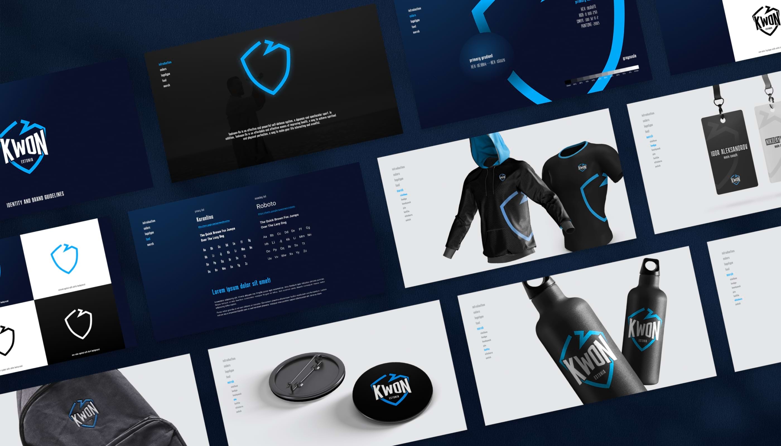
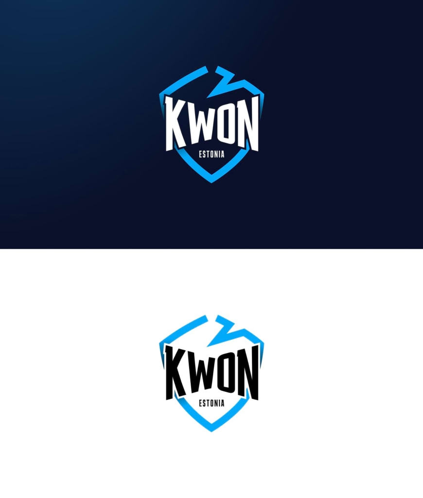
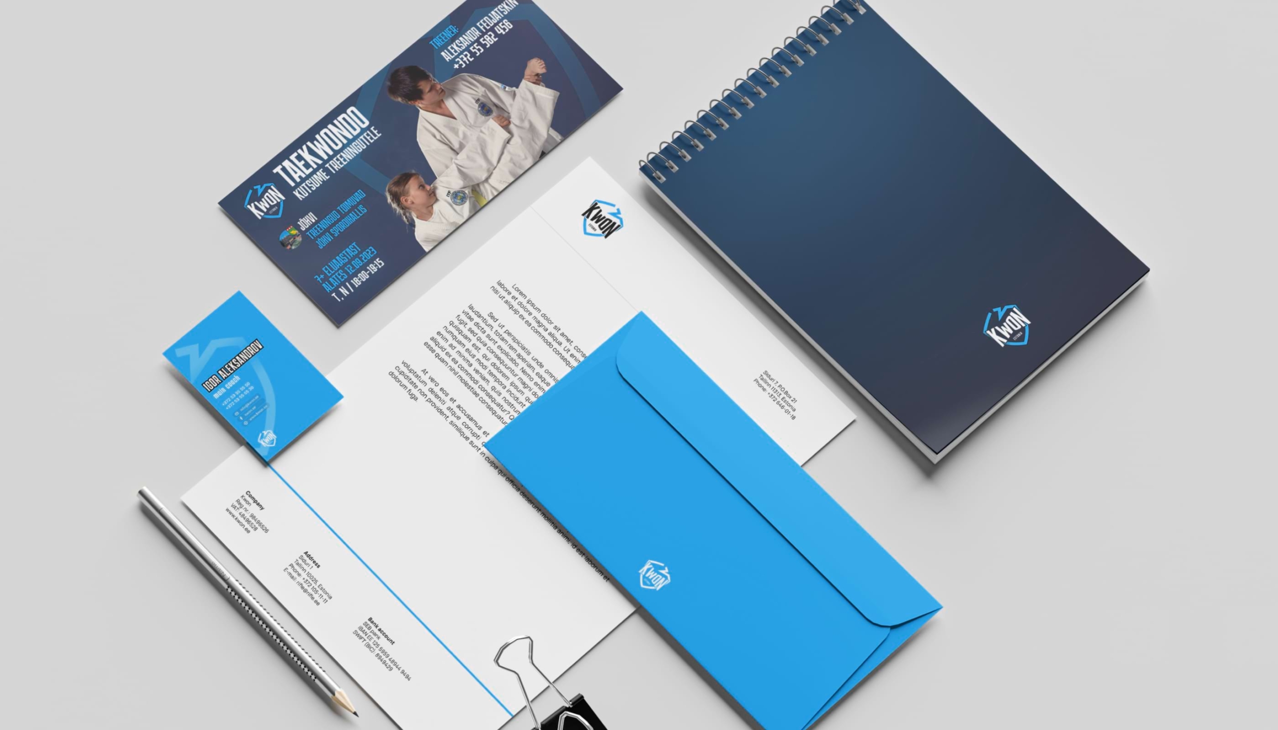
Kwon’s branding fuses a deep blue gradient with light blue to capture the essence of Taekwondo. The broken shield element symbolizes defense and resilience, key traits in martial arts.
website
gateway to martial arts world
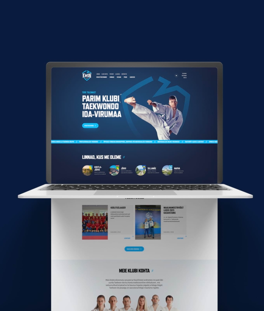
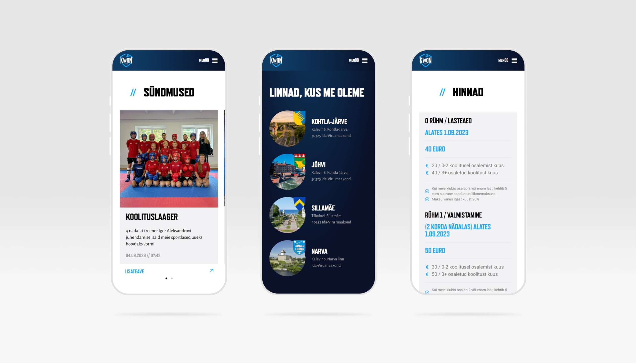
Kwon’s website is a comprehensive digital platform showcasing their expertise in Taekwondo. Its dynamic design mirrors the energy and discipline of the martial art, offering detailed insights into their services and philosophy.

visual representation of taekwondo
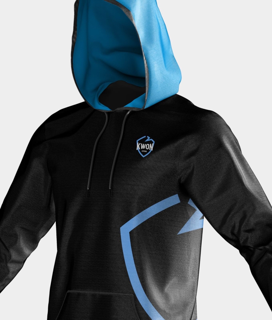
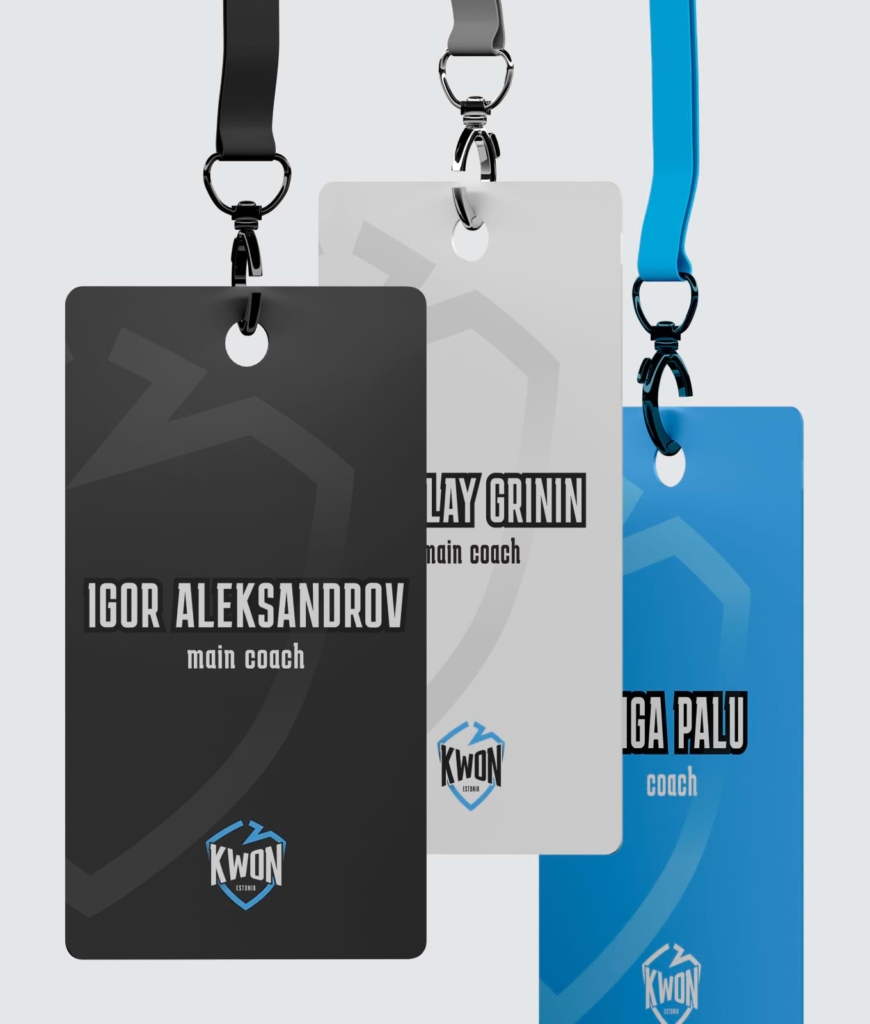
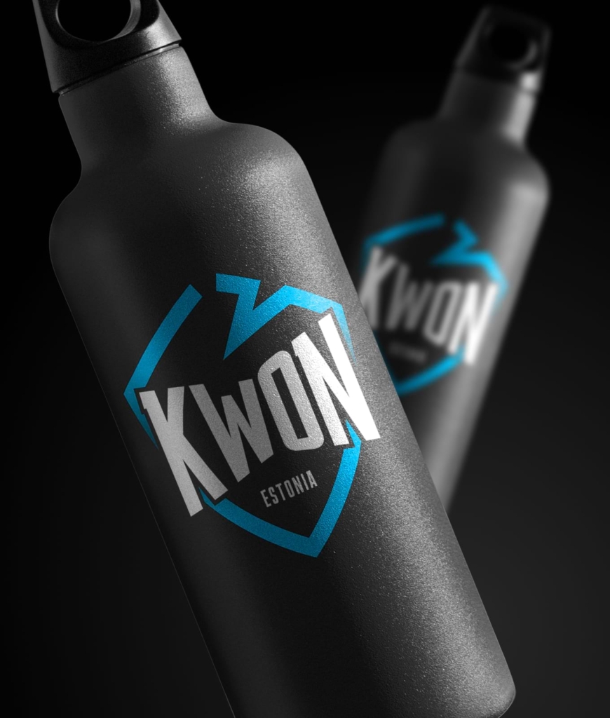
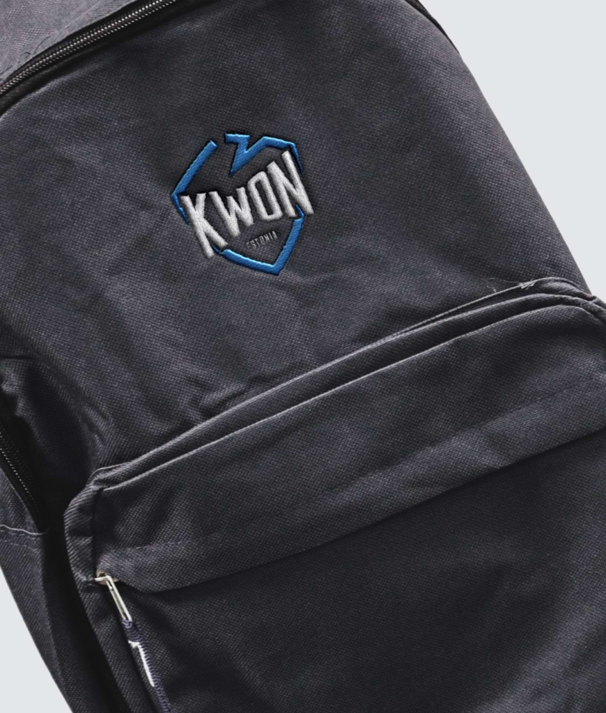
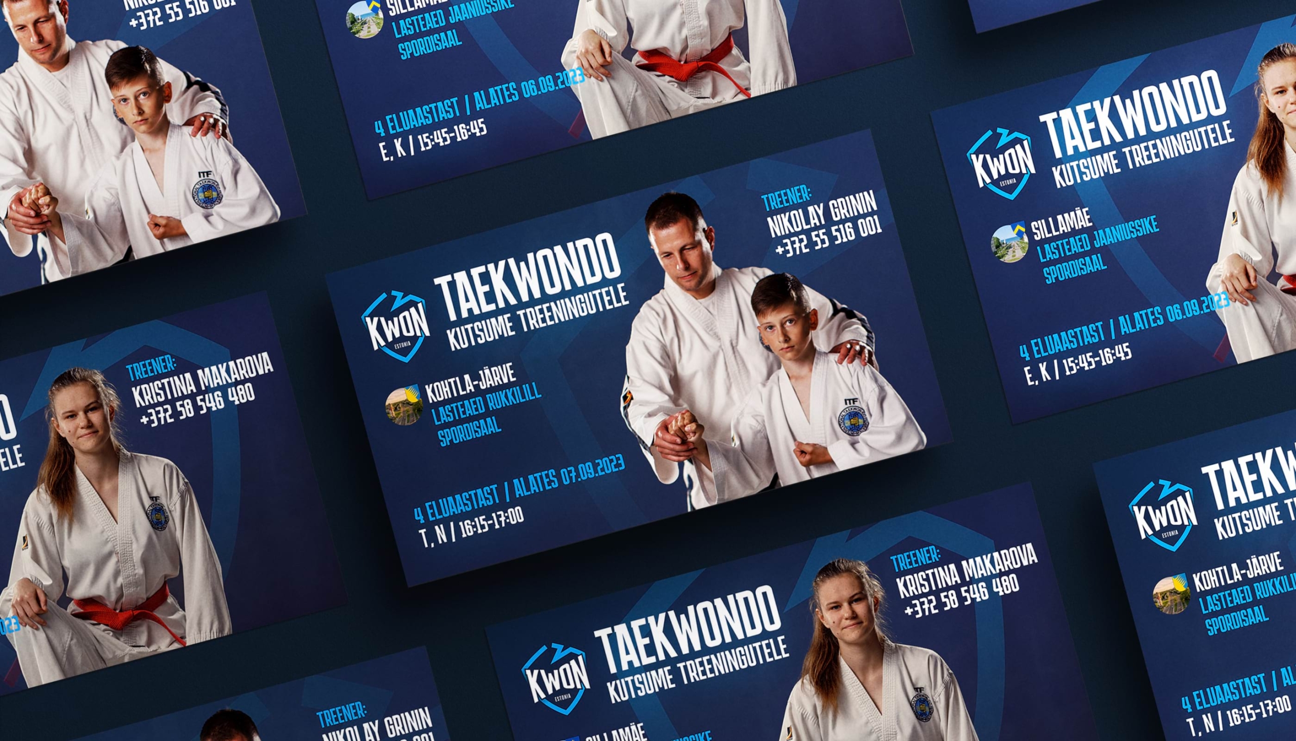
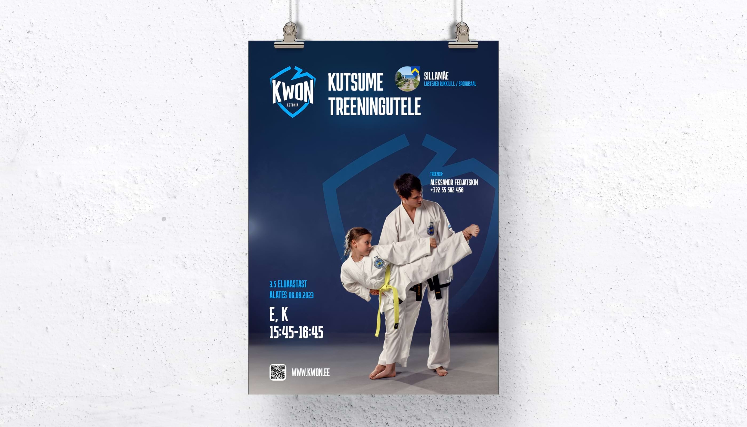
Kwon’s print materials, including posters, business cards, and branded merchandise like bottles, backpacks, and hoodies, reflect the discipline and spirit of Taekwondo, blending functionality with the martial art’s ethos.
Viktor Jakovlev brand design
Jorka Gahokidze website design
Mila Popova brandbook & merch design
Roman Ustinov development
Ilya Grytsayev development
Anton Gritsyuk qa & management